
.svg)


.webp)
Every day, millions of tracks compete for attention on Spotify, Apple Music, TikTok, and beyond. Before a single note plays, listeners make a split-second decision based on one thing: your cover art. It's your storefront, your handshake, and your first impression — all compressed into a tiny square on someone's phone screen.
And yet, artwork is one of the most common reasons releases get delayed or rejected during distribution. Let's fix that.
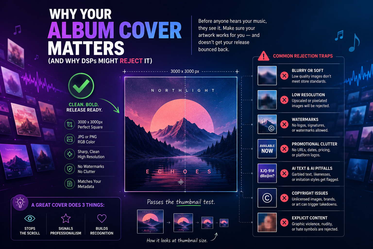
A strong album cover does three jobs at once:
It stops the scroll. Whether someone's browsing a playlist, scrolling Release Radar, or flicking through TikTok sounds, your artwork is competing with hundreds of others. Generic, cluttered, or low-effort covers get skipped — often without the listener even realizing they made a choice.
It signals professionalism. Listeners, playlist curators, and editorial teams make instant quality judgments. A polished cover tells them the music behind it is worth their time. A blurry phone screenshot tells them the opposite — even if the track is brilliant.
It builds recognition. The most successful independent artists treat their artwork as part of a visual identity. Consistent colors, typography, or imagery across releases means fans recognize your new single instantly, before they even read your name.
Here's the single most useful exercise before you finalize any cover: shrink it down to the size of a postage stamp and look at it on your phone.
That's how most people will experience it — as a tiny thumbnail in a playlist, a search result, or a social feed. If your title is unreadable, your image turns to mush, or the whole thing blends into a gray smudge, it doesn't matter how good it looks at full size. Bold shapes, strong contrast, and simple compositions win at thumbnail scale. Intricate detail and thin fonts lose.
DSPs have strict artwork requirements, and getting them wrong is the fastest way to delay your release. Before you upload, make sure your cover is:
Beyond the basics, these are the issues that actually get artwork flagged during review:
Upscaled low-resolution images. Taking a 500px image and stretching it to 3000px doesn't add detail — it adds blur. Stores can tell, and so can listeners. Always start from a high-resolution source.
Unlicensed images. That photo you found on Google, that still from a movie, that brand logo — if you don't own it or have a license for it, it can trigger a takedown even after your release goes live. Stock photos need the right license tier for commercial use.
Misleading imagery. Artwork that features another artist's name or likeness, imitates a famous album cover too closely, or implies a collaboration that doesn't exist will be flagged as misleading content.
AI-generated artwork pitfalls. AI tools can be a legitimate part of your creative process, but be careful: covers that include garbled AI-generated "text," depict real people without consent, or closely mimic a recognizable artist's style are increasingly being flagged by stores. If you use AI tools, review the output critically and make sure the final image is genuinely yours to use.
Explicit imagery. Graphic violence, nudity, and hate symbols will get artwork rejected outright. If your visual concept pushes boundaries, have a clean alternative ready.
Some of the most iconic covers in music history are radically simple: a color field, a single object, bold type on a plain background. What they share isn't production budget — it's intention.
Before you design (or brief a designer), answer three questions:
If you're working with a designer, share your music, your references, and those three answers. If you're doing it yourself, constraint is your friend: one strong image, two colors, one readable font will beat an overloaded collage every time.
Your album cover is the only part of your release that every potential listener is guaranteed to experience. Treat it with the same care as your mix and master: start from a high-resolution source, keep it bold enough to survive the thumbnail test, follow the technical specs, and make sure every element of the image is yours to use.
Do that, and your artwork stops being a formality - and starts being the thing that turns a scroll into a stream.
.webp)
.webp)

